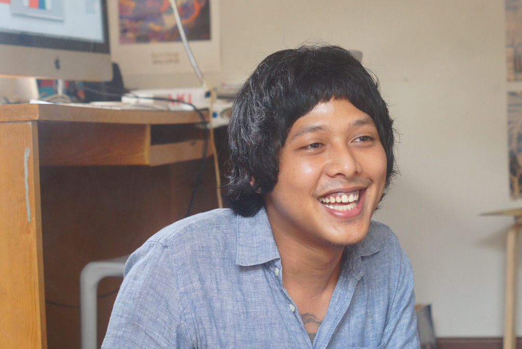
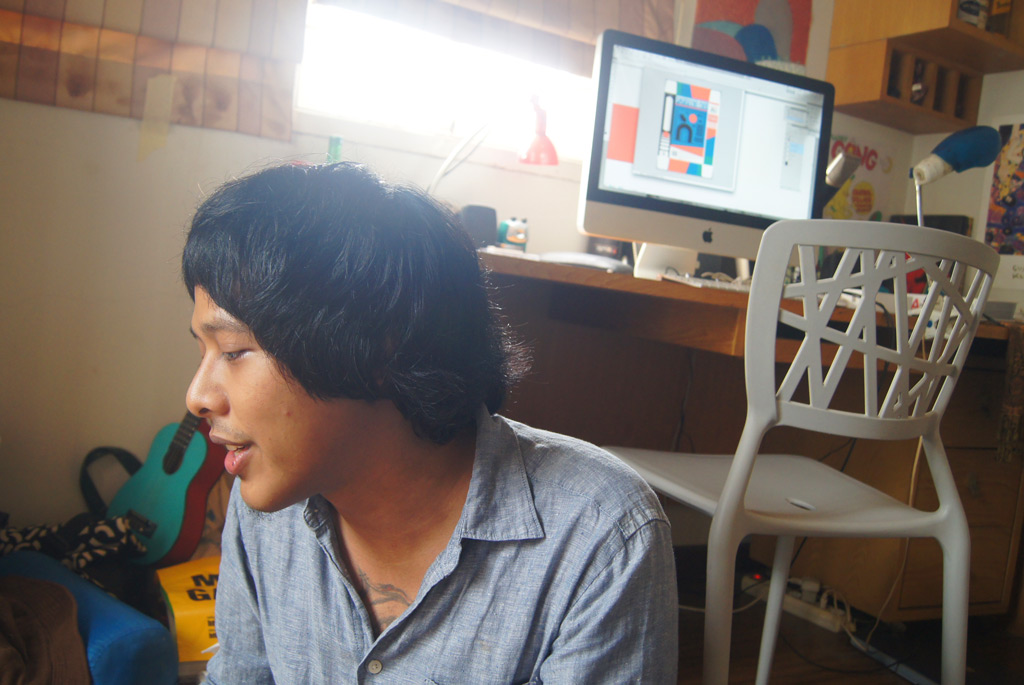
Outsider Art with Kendra Ahimsa
Ken Jenie (K) talks to artist Kendra Ahimsa (KA).


by Ken Jenie


K
How did your interest in the arts begin?
KA
I’ve been interested in the arts since I was little. My earliest memory would be during grade school, reading comic books and watching cartoons. I would read any comic books from Gramedia. In school, we used to have to submit our notebooks and usually, my notebook would have class notes in the front, and drawings in the back. My teachers would always call on me about that (laughs).
K
When did you become serious about the arts?
KA
Growing up, I have never thought about doing illustrations in a serious manner, but I did know that I wanted to be in a creative field. When I graduated high school, when it was time for students to choose which field they wanted to pursue. Most students had very clear ideas of their careers; they wanted to be doctors, engineers, etc. I didn’t dare to pursue fine arts. I finally chose graphic design because I felt it was a good middle ground between the arts and a ‘professional’ line of work.
I enjoyed graphic design, and until this day I feel that the lessons I have learned helps me – color theory, composition. I do feel that graphic design has limitations that you cannot avoid. When drawing, you are totally free to illustrate whatever and however you want – there is a freedom. I felt that my strength is in illustration, and if I could combine it with what I have learned in graphic design, I think I can make something good – that is what I am working on at the moment.
K
Even with those reservations, did you work as a graphic designer?
KA
Yes, and I still do graphic design jobs. My illustrator self with my graphic designer self are separate, and I would like both to be more collaborative. Ideally, a person would ask me to design their album, but will also enjoy my illustrative work, so I could combine the two.
K
From what we have seen of your work, there are many musical references sprinkled through out. What is your relationship with music like?
KA
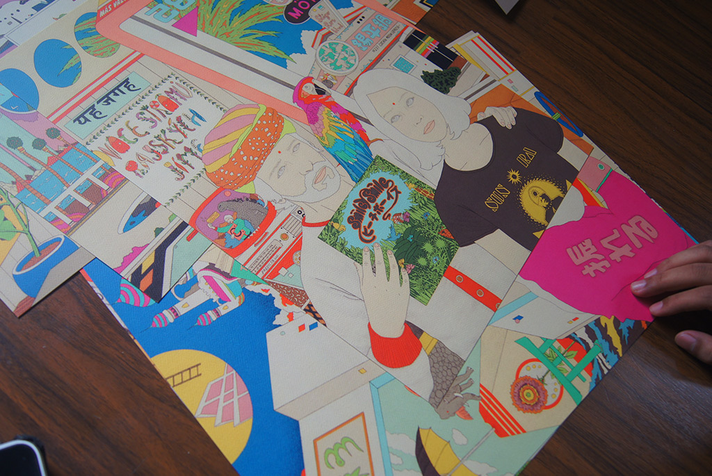
Everybody has their own process, and for me personally, it comes from music and film. Before I start drawing, I would get a rough idea from observations and conversation. I would then either create a playlist on iTunes or watch films. Sometimes, while I listen to music or film, I would get an inspiring moment where I want to combine what I am listening to or watching into my illustration. I usually work while listening to music or watching films.
I would have a Jacks poster or a David Bowie illustration in my drawings. They are simply elements in the composition. I like trivial things. I don’t quite know how to explain it, but let’s say I just watched a film and Wikipedia’ed about it, I would like to channel it through my drawings.
K
It’s your personal experiences being illustrated in your works?
KA
It’s sort of a slightly complex self-portrait.
K
As we are speaking about music and visuals, how would you explain their relationship?
KA
It really depends… visuals can either enhance or deter the music. For example, when a music video doesn’t translate the music, it can be quite bothersome.
K
What should it be like, ideally?
KA
I think it depends on the portion and balance… I don’t know, I’m confused (laughs).
K
You have done illustrations for music projects, how do you approach creating their visual counterparts?
KA
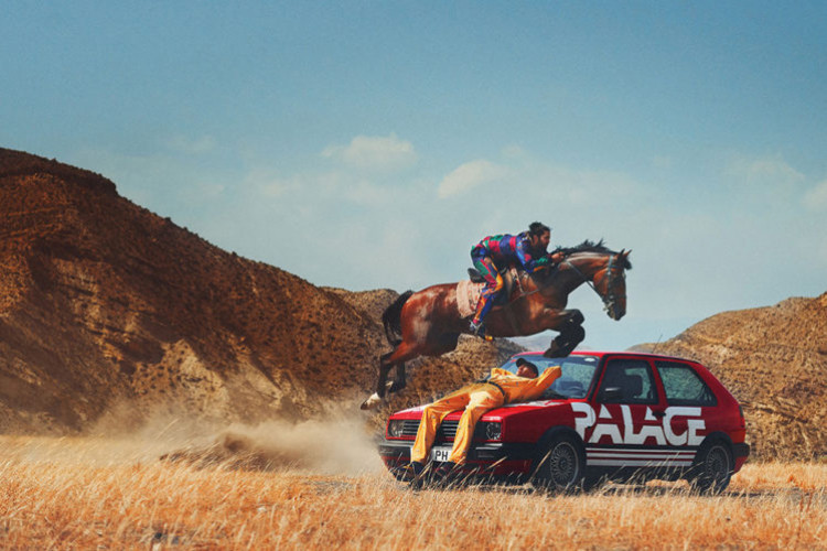
Ideally, the visuals should be the introduction to the music. For example, while working on Polka Wars’ album, I am trying to create an image that corresponds with the music. When somebody listens to Polka Wars’ music, I want him or her to look at the artwork and say “this is very Polka Wars.”
K
Also from our observation, there seems to be an element of spirituality and consciousness in your illustrations. Could you tell us where this came from?
KA
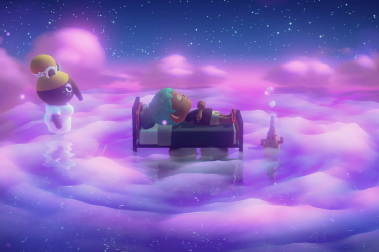
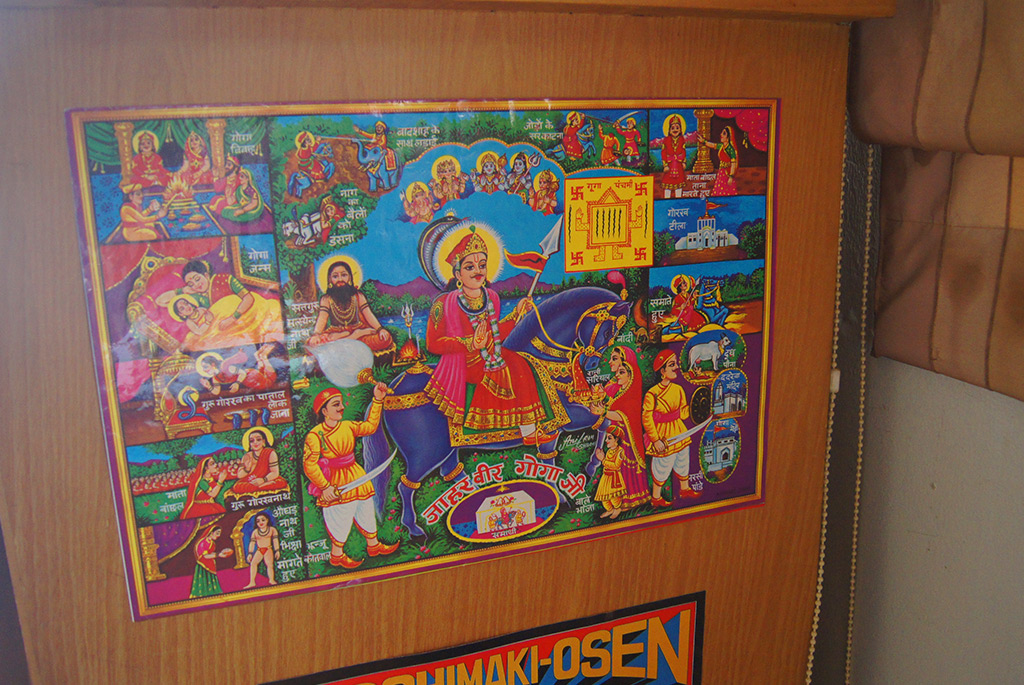
My father happens to be… not spiritual, but he has an interest in those things. Recently he came home and told me that he met someone who can tap into chakras, and I was like “wow, that is random” (laughs). I grew around this open-minded perspective on spirituality. My work, Kamala, was very much based on Ram Dass’ books.
K
So the topic of spirituality is just an everyday experience?
KA
It is a topic that is quite normal in the house – it is quite natural.
K
The theme of spirituality was also prevalent in the art of the late sixties. Would you say that there is a visual language to present consciousness?
KA
No, not really, I believe it is a personal thing. During that era, and I am basing it on posters I have seen from that era, every artist has his or her own approach. There might be commonalities, perhaps in colors or composition, but over all drawing is psychoactive and individual.
K
In your own work, do you purposely address this spiritual theme?
KA
Perhaps because I used to draw a certain way, people identify my work with a certain style. That is why at the moment I am trying to get out of my comfort zone, for example, I used to create black and white images and now I am doing full color. I would like to break this limited perception.
The theme of spirituality will probably still appear, but I hope it will not dominate my works. I just want to work as honest as I can.
K
You use a very distinct color palette for your work. They are very colorful and often contrasting. What is the reason behind your choice of colors?
KA
As I learned how to draw I experienced development phases. I began with black and white drawings, but soon became bored of it. When I look at my influences, my idols, I wonder what make their work stand out. They all have their own distinct character, for example, you look at Miles Davis’ Bitches Brew and you say that Mati Klarwein did it – it’s very him. I would like to have that character, and what I noticed was that one of the elements that can make an illustration distinct is the color palette. I began looking for my own color palette – I first began with two, and now I have reached a point where I have my own blue. Color combinations can really be the personality of a composition.
You can notice colors from miles away, the first thing you see is the colors. The closer you get a sense of the composition and the shapes and details of the work.
K
So now you are comfortable with your color palette, and what are you looking for now, the shapes?
KA
I think I have found my style of illustration. I hope people will notice. Now that I have my own style, I feel more comfortable and focus on the themes and composition.
K
You are also well known in the music scene as someone who makes posters. What is the creative process like to create music gig posters?
KA
I would usually talk to the person throwing the event and ask them things such as the name of the event, the performers, what the event is about. Then I brainstorm from what I learned, create sketches, and when I find one appropriate I work on them.
I also listen to the performers’ music. I try to get a feel of their music and inject their personality into the poster.
K
You wrote on your Cargo Collective site that “… a poster should be appreciated as its own artform. So people would stop to look and actually make an effort to decipher it and all its information.” Can you explain, and what should a poster be like ideally?
KA
Today, the development of graphic design seems to be geared towards a minimalist style, where the text is very neat. When you look at a poster, what you see is what you get – the name of the event, content. Some people do it really well, but for me, it gets boring.
Since poster making is an art form, there really is no limitation. You can make the text really small, or long, twisting and turning, do what ever you want. Posters that I like invite people to see them, and then they discover that this band or this person is performing.
But of course, it depends on the poster. If the poster is for a seminar, that style probably can’t have the character I mentioned. I do believe for music gigs they have to be interesting, you don’t have to be too ‘functional.’
I’m not saying that all posters should be psychedelic, though. If a person is interested is in making posters that are minimalist, then that person should explore the minimalist style further and make it more interesting.
K
Your medium of choice is using the printed medium. Could you explain why you tend to use it?
KA
I have thought about painting. When you paint, there is only one copy, and it will usually be sold at a high price, and that creates a distance between the viewers and the artform – the painting will probably be displayed publicly, but it isn’t owned by anyone. With Prints, everyone can take one home, and it feels like there is a more personal relationship with the artwork.
K
Have you painted before?
KA
Yes, but I feel more comfortable with print.
K
What is your creative process like?
KA
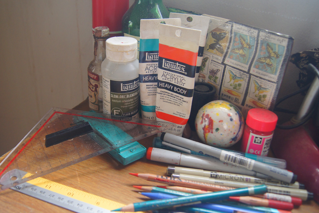
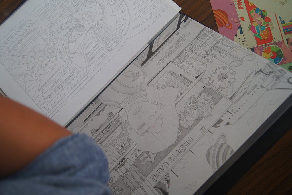
I would usually illustrate it by hand at first, scan it, and then color it digitally. I don’t think I can achieve what I want through painting.
K
What are some of your influences?
KA
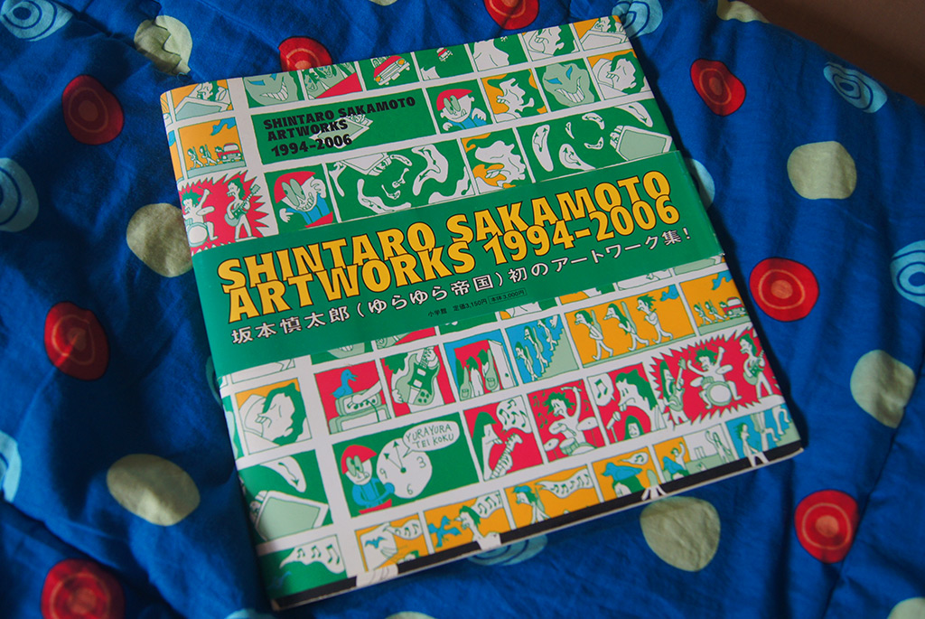
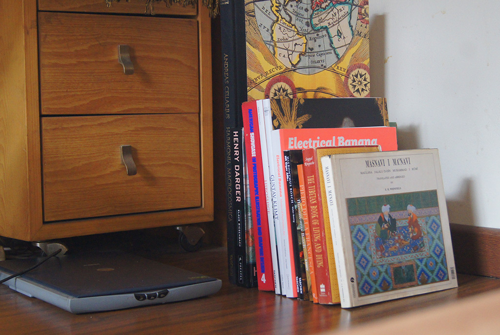
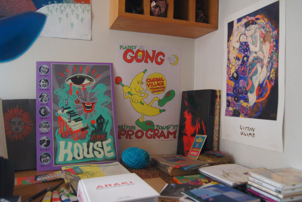
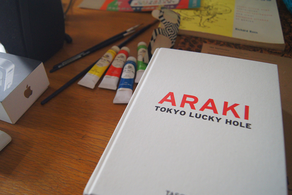
One of my favorites is Tadanori Yokoo. There are no boring elements in his posters, and all of his posters are different yet distinct. I also have a book of psychedelic posters.
K
Posters are functional, but it seems like in the psychedelic era it was very much steeped in the aesthetics.
KA
Yeah, that’s why I believe that posters are its own artform, and we shouldn’t be limited by its functional value – especially today when technology has made it easier for us to create them. Exploration is more accessible now, and you can make weirder things now.
K
Any other influences?
KA
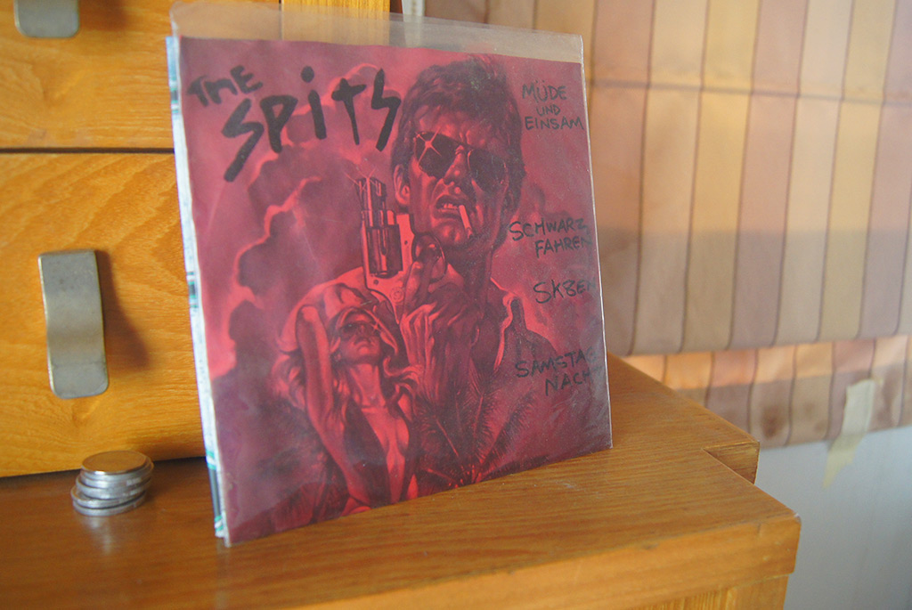
I’m very much influenced by the late 60s/psychedelic era. In terms of music, I love vinyl covers. If you like composition, vinyl covers have many different and strange composition.
K
I find record covers to be interesting because they are all the same square canvas.
KA
Yeah, it’s different from posters that are most likely rectangular. LPs make you try to create a balanced composition in a square space.
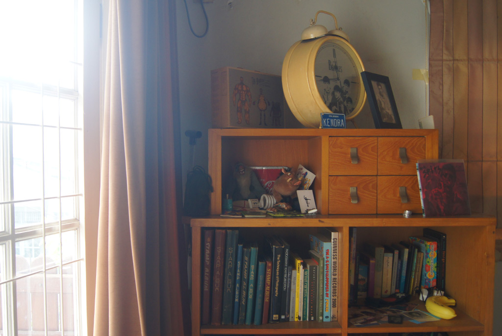
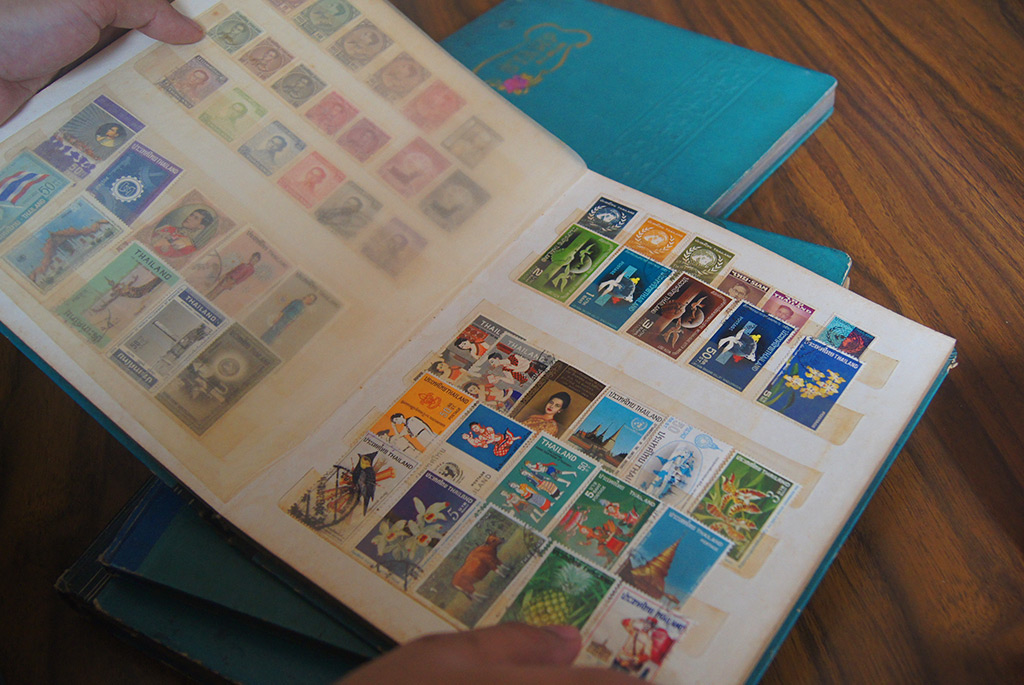
I’m also influenced by stamps.
K
Stamps? I did not expect this.
KA
My grandfather collected stamps, my father continued the collection, and then I continued collecting them because of him. Stamps are crazy; they’re like LPs but a lot tinier. Stamps usually come out in series, and the art on each are different but they can coalesce as one complete piece.
K
What satisfaction would you say you get out of collecting stamps?
KA
The same out of collecting everything else. I enjoy putting the stamps in order and archiving them. They are so small and detailed, it’s like looking at a painting, but a very small one.
There are all sorts of strange stamps from different places. I think my father had penpals… I’m not sure, I like to come up with stories regarding the stamps origin (laughs).
K
What are your observations regarding the Indonesian or Jakarta art scene?
KA
I think the art scene is developing in Jakarta. There are many great exhibitions here, and when I go I can feel a ‘Jakarta’ style to the art.
K
How would you define the Jakarta style?
KA
It’s urban. The Jakarta Biennale really exhibits this, addressing the urban experience such as traffic jams, etc. I believe that many Indonesian contemporary artists are getting international attention – Eko Nugroho, Angki Purbandono, etc. I find out about these things because my girlfriend works as an art consultant, and she informs me about these artists.
K
Your work and name has started to become known in the music and art scene. Do you have an interest in being involved in doing exhibitions?
KA
I don’t want to say that it won’t change in the future, but right now I would like to create my own ‘realm’ – to be an outsider artist. When you do group exhibition, you have to follow a certain theme, and at the moment, that isn’t what I would like to do. I still want the freedom that I have right now and explore my own world.
I am planning a solo exhibition, and perhaps after it I will see the other options.
I really would like to stress that I am not trying to be a snob or say that I am not interested in being part of the art scene, I just want to explore my own world right now.
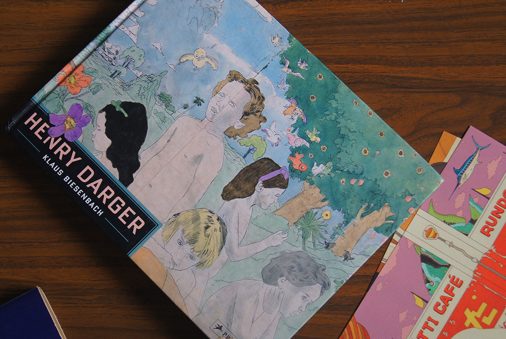
This was inspired by Henry Darger, which people would classify as an ‘outsider artists.’ Henry Darger was a janitor who passed away when he was in his 80s. When he was alive he would lock himself in his apartment after work and nobody knew what he was doing. When he passed away, the landlord opened his apartment and found tens of thousands of parchments with his drawings. He created a 15,000-page book titled “The Story of the Vivian Girls, in What is Known as the Realms of the Unreal, of the Glandeco-Angelinian War Storm, Caused by the Child Slave Rebellion.” He created art for fun and exploring his own world, which is something I would like to do right now.
K
You have a Souncloud page where you record music and it is quite good.
KA
(laughs) I just make music for fun, I used to record with a laptop’s built in microphone. I played music in highschool, and played covers.
K
Your music has a similar atmosphere to your illustration. When you create music for fun, are there similarities to when you create illustration?
KA
I just feel like I’m being me, it isn’t anything I’m doing on purpose. Perhaps my mood and personality seep into what ever I’m doing and it is translated into my work.
K
What can we look forward to from Kendra Ahimsa?
KA
I am currently saving money to create a solo exhibition. I would like to create a cohesive body of work, where visitors can be overwhelmed and enter my realm.
K
When will this be?
KA
I’m trying to do it at the end of the year, but like usual, there are some factors that needs sorting out.
I’m also planning a collaboration with The Ballet Cats. I have done collaborations with them in the past, and recently I was asked to make music for them. I brainstormed and tried to make strange music, I came up with a song titled “Cat Penis” (laughs). This isn’t anything too serious, we’re just having fun with it.